Data Storytelling Skills
After reading the book The Art of Data Storytelling , I realized that data storytelling skills (including data visualization & data presentation) are an extremely important skill in a world where data is gradually penetrating every tiny human activity.
Data can be considered an input raw material for businesses. It provides businesses with insights into various aspects surrounding their business operations. From there, it helps businesses make better decisions to improve operational efficiency as well as enhance the quality of products provided to consumers.
However, mining and interpreting numbers into specific stories to provide actionable insights is by no means an easy issue. Therefore, this article will summarize the core information so that we can improve one of the vital skills of the current digital era.
The contents covered in this article include:
2. Why is "data storytelling" an important skill?
3. Techniques to become a professional data storyteller
1. What is data storytelling?
In the context of the modern world, data is increasingly regarded as a valuable asset for businesses.
An abundant amount of data combined with deep analysis will provide businesses with an overall picture of business performance. From there, business leaders will pinpoint the problems the enterprise is facing and simultaneously plan to capture potential business opportunities.

On par with the importance of oil in the second industrial revolution, data is considered the "new oil" in the fourth industrial revolution!
So specifically, what is data that makes it so important to businesses in the new era?
Simply understood, data is facts and statistics collected during the operation of a business . It can be represented in any format, such as numbers, tables, images, videos, audio recordings, sensor data, and so on.
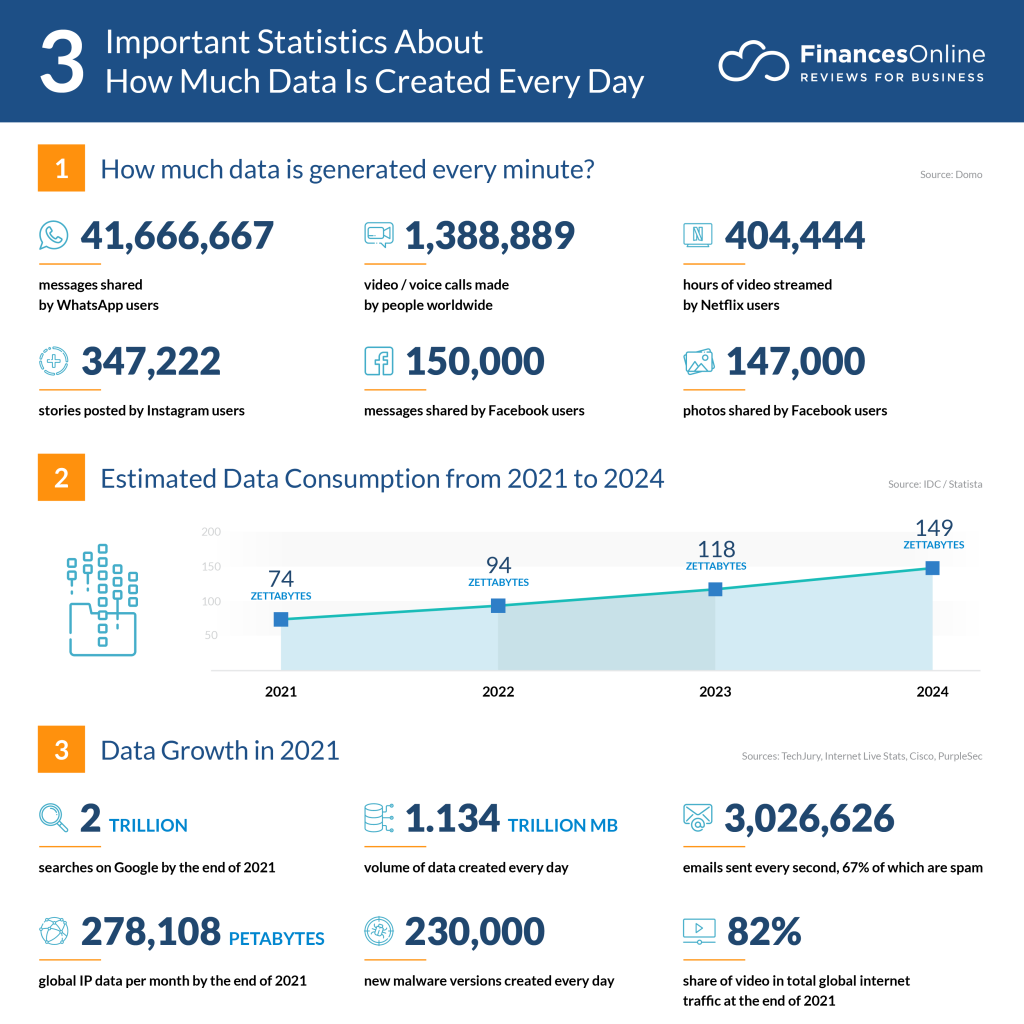
In 2010, every 2 days the world created an amount of data equivalent to the data generated from the advent of computers up until 2003 . Today, the amount of data created every day is even far greater!
Behind every dataset lies a hidden story. And extracting a story buried under tons of noisy information is by no means easy.
Therefore, modern businesses always crave employees who can:
Collect & filter raw data.
Present data structurally to easily uncover the stories hidden inside.
Provide actionable insights and strategies to achieve specific goals.
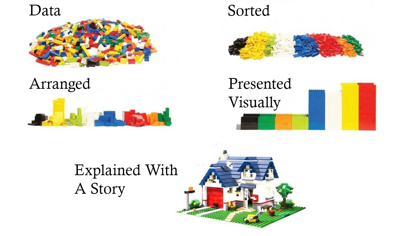
That skill is precisely the data storytelling skill .
2. Why is "data storytelling" an important skill?
Despite playing a key role in decision-making, data is something relatively dry and belongs to rational thinking . It often makes people approaching it tend to feel bored and sleepy while absorbing and exploring it.
In contrast, good, engaging, and inspiring stories belong to emotional thinking . A good story will stimulate the audience's curiosity and keep them more engaged in following the evolving content.
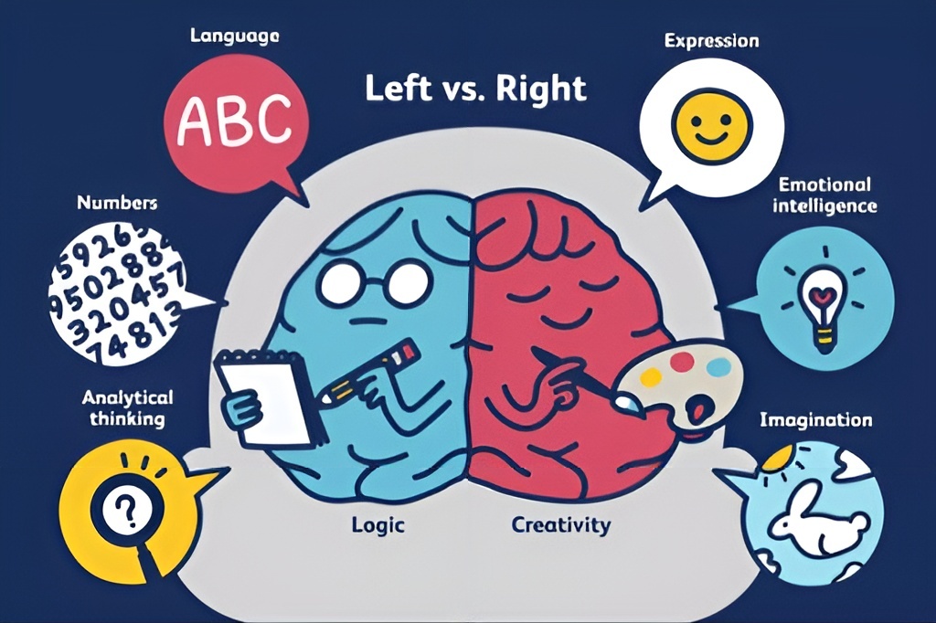
Combining data analysis skills with storytelling skills will harmonize both rational and emotional factors . The audience will feel more emotional connection to follow the story we want to tell, while also obtaining accurate information based on the data provided.
Below are the 2 most outstanding benefits that data storytelling skills bring:
-
Easier to remember data: According to research by Professor Chip Heath , 63% of people can remember stories, but only 5% of people can remember statistics. Connecting data with compelling, engaging stories will trigger the audience's emotions and make it easier for them to remember "dry numbers" through the story content conveyed by the presenter.
-
Higher persuasiveness: Humans often do not rely solely on numbers or logical thinking to make decisions, but rather on emotions. Therefore, no matter how carefully we calculate options, most of our choices depend on emotions at the moment we make a decision . Thus, an emotional story will stimulate listeners' feelings and lower their defensive mindset. Naturally, that makes it easier for us to convince listeners.

According to mathematician Allen Paulos's observation, in listening to stories we tend to suspend disbelief in order to be entertained, whereas in evaluating statistics we generally have an opposite inclination to suspend belief in order not to be beguiled .
3. Techniques to become a professional data storyteller
Thus, we can partly see that data storytelling is an extremely important skill in the modern economy. To enhance this skill, here are 3 aspects you need to pay attention to:
3.1. Understanding the audience
No one is interested in spending time researching an issue they don't care about. Therefore, understanding your audience and the problems they are facing will help your story content easily hit the listeners' interest, making your story more engaging for each target group.
3.1.1. Who is the audience? And what do they want to see from data?
Each audience group has a unique interest. The important thing is not how high quality your data is, but whether you have provided data suitable for your audience.

According to Jim Stikeleather - CIO of Dell Corporation, audiences should be classified into the following main groups:
-
Inexperienced audience → Information needs to be simple and easy to understand .
-
Novice audience → Information needs to be high-level and systematic .
-
Management level → What specific action should be taken after the presentation? Present clearly, coherently, and logically .
-
Experts → Explore data as deeply as possible to find patterns, with less concern for structure or storytelling style .
-
C-level Executives → Key conclusions of the presentation. Proposed solutions. The optimal solution (and immediate action) .
3.1.2. Find out the real problem the audience is facing

From the observed data, you need to highlight the practical problems that the audience will encounter.
Numbers "cannot speak for themselves," so the audience needs us to explain their meaning in detail. In particular, managers can only be attracted when numbers strike directly at pain points or offer opportunities to satisfy expectations.
Below are basic steps to identify and satisfy audience desires:
-
Step 1: Identify the target audience .
-
Step 2: Clearly determine how the presentation content relates to the audience's desires .
-
Step 3: Find data and prove it is closely linked to the audience's desires .
-
Step 4: Present ideas in a deliberate structure .

In addition, to know more clearly what the audience really wants , you can:
Learn about goals or projects that the audience (or their department) must complete during the year/quarter.
Learn about key performance indicators (KPIs) that the audience frequently uses in their work.
Learn about issues that the audience frequently mentions in meetings.
And most simply, talk directly with the audience.
3.1.3. What if your audience is C-level managers?

Although they also have 24 hours a day like us, as senior executives (C-level Managers), they have to handle many crucial tasks. Therefore, they sometimes have to prioritize time for more critical work and do not have much time or patience to listen to our entire presentation.
Below are common problems and solutions when presenting to C-level managers:
-
No time → Get straight to the point + Present concisely and clearly + Propose actions .
-
Impatient → State presentation length in advance + Allocate most time for Q&A (For example: if allocated 30 minutes, spend 5 minutes presenting and 25 minutes for Q&A) .
-
Prone to interrupting → Welcome interruptions + Prepare a clearly structured presentation so you won't be derailed if interrupted .
In addition, pay special attention to things that C-level managers really want to hear:
-
Money → Which factors reduce costs and increase revenue/profit?
-
Market share → Which factors help expand market share/coverage and reduce time-to-market for products?
-
People → Which factors increase employee/customer engagement, satisfaction, and loyalty while reducing turnover risk?
3.2. Storytelling methodology
To create masterworks, in addition to using their creativity, painters must rely on rules of art such as the golden ratio, perspective, color theory, etc., as the foundation for their work.
To tell a good story, we similarly need to rely on storytelling models and structures considered foundational in literature, theater, and cinema.
3.2.1. Gustav Freytag's classic storytelling model

Gustav Freytag's storytelling structure is called the Pyramid Dramatic Structure . It is a structural model used in literature, drama, and film to build emotion and arouse curiosity in the audience.
Gustav Freytag's Pyramid Dramatic Structure model consists of 5 stages:
-
Exposition: The protagonist, background, and situation of the story are introduced.
-
Rising Action: The protagonist faces challenges and difficulties to achieve their goal.
-
Climax: At the peak of the story, the protagonist must make a critical decision or face the greatest challenge.
-
Falling Action: After the climax, events unfold to resolve conflicts and lead to the final result.
-
Resolution: Conflicts are resolved, and the story concludes with a final solution or consequence.
Applied to a practical presentation, we can use Gustav Freytag's storytelling model as follows:
-
Introduction: Set the scene with a hook detail that maximizes audience attention .
-
Body: Portray the problem or opportunity → Build the situation to a climax that stimulates audience emotions, making them eager to solve the problem (highlighting issues that may arise from the situation introduced) .
-
Conclusion: Share solutions and propose an action plan .
3.2.2. Connecting and comparing data with something familiar
Connecting data with a familiar object or concept helps the audience easily visualize and grasp the issue we are addressing (very effective when describing huge or tiny numbers that are hard to visualize).
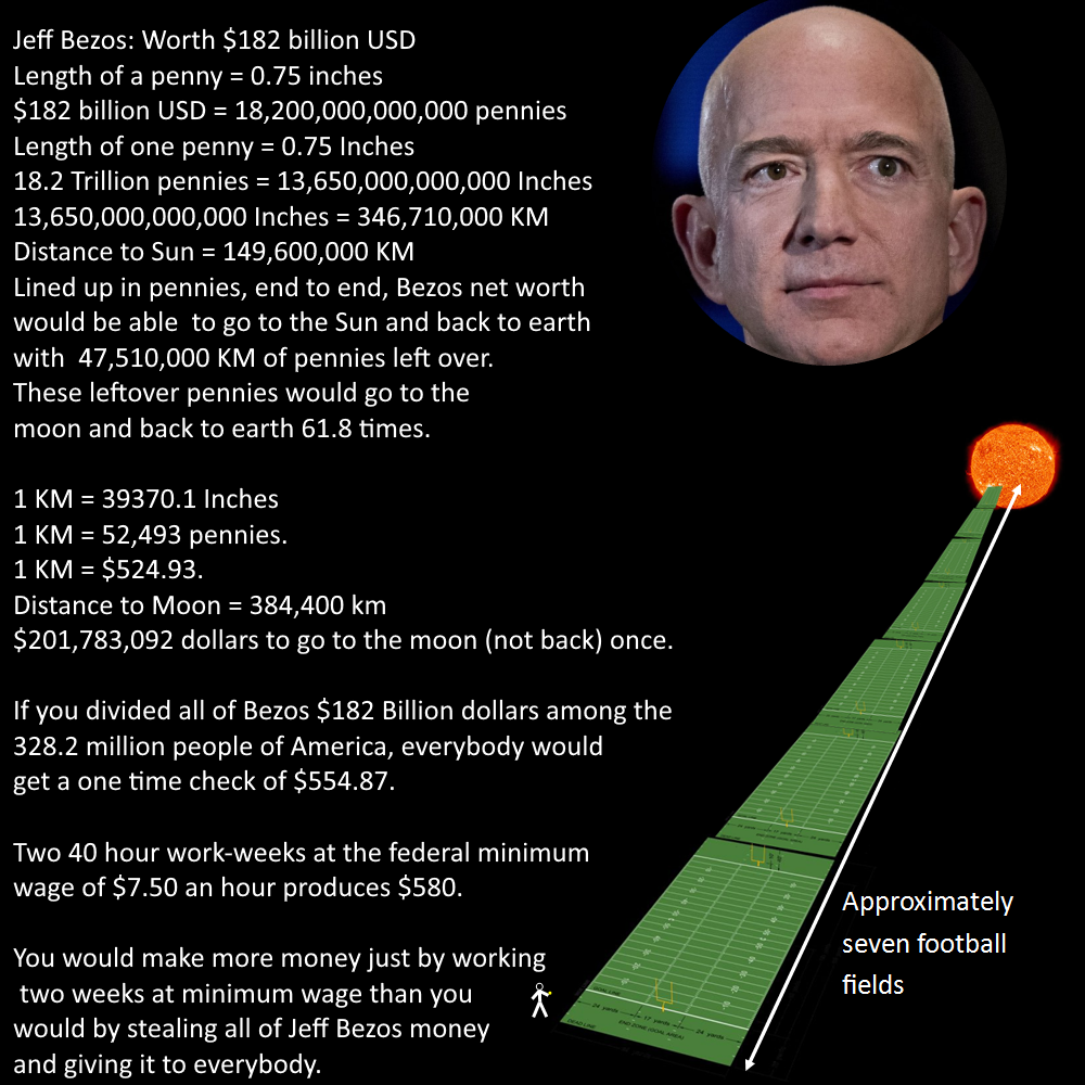
For instance, in this post , Jeff Bezos's $182 billion wealth is described by lining up 1-cent coins (pennies) into a string. That string could stretch from Earth to the Sun and back to Earth, and still extend from Earth to the Moon and back 62 more times.
That is showing the audience how massive Jeff Bezos's fortune is by comparing it to distances between Earth, the Sun, and the Moon.
Another example is comparing the harmful effects of fine dust pollution (hard to visualize) with the harm of smoking cigarettes (easy to visualize) in this article by Zing News .

"In Ho Chi Minh City, a person breathing air with a PM2.5 concentration of 21.6 micrograms/m³ suffers health consequences equivalent to smoking one cigarette daily. In Hanoi, this number sometimes reaches up to 10 cigarettes." - Quoted from Zing News
You can see that even comparing fine dust particle size (hard to visualize) with hair strand thickness (easy to visualize) helps the audience imagine it much better.
3.3. Data visualization skills
Looking at the data table below, what do you see? Is it hard or easy to read? Interesting or dry?
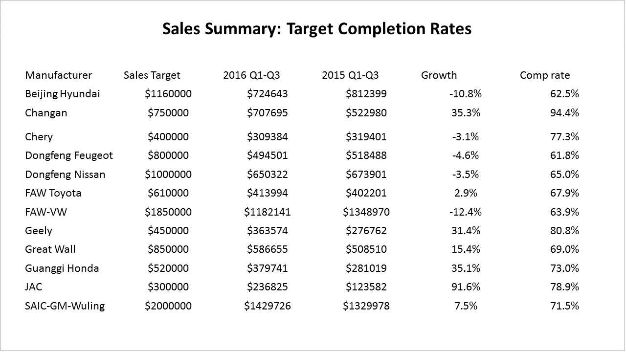
Nowadays, the amount of data we receive daily is 5 times higher than in 1986 . Data visualization helps the audience easily spot insights & highlights of the information we want to convey.
In addition, MIT researchers discovered that visualizing data with images increases the audience's willingness to read data by up to 90% . This means how we present and share our data stories significantly determines the number of people willing to listen to us.
To make presentations more engaging for your audience, here are several basic data visualization techniques you can apply:
3.3.1. Data representation principles
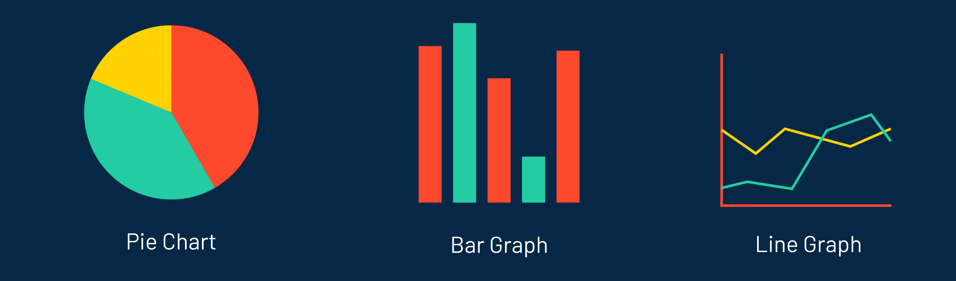
There are thousands of chart choices and tables to represent data. However, mastering just the 3 simple chart types below is enough to represent 95% of data in most cases.
Line charts describe progress over time → thereby identifying data trends .
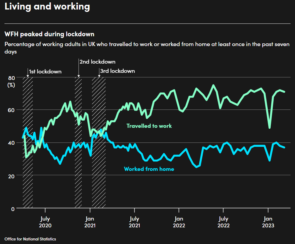
The line chart above shows the work-from-home vs. office trend among UK citizens across 3 pandemic lockdowns up to the current "new normal."
Bar charts describe the value of a quantity → thereby comparing relative values between quantities .
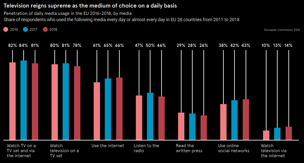
In the bar chart example above, we can easily compare media consumption rates among European citizens over 3 years (from 2016 to 2018).
Pie charts describe component structure → thereby comparing each component's proportion relative to the whole (or to other components) .
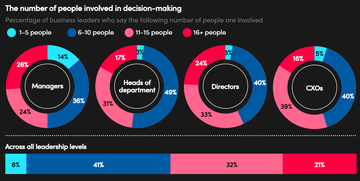
As in the example above, through 4 pie charts, we can easily compare the number of people involved in decision-making across 4 management levels.
In addition, an important detail to note when presenting data is to always keep charts simple and closely related to the story you want to tell .
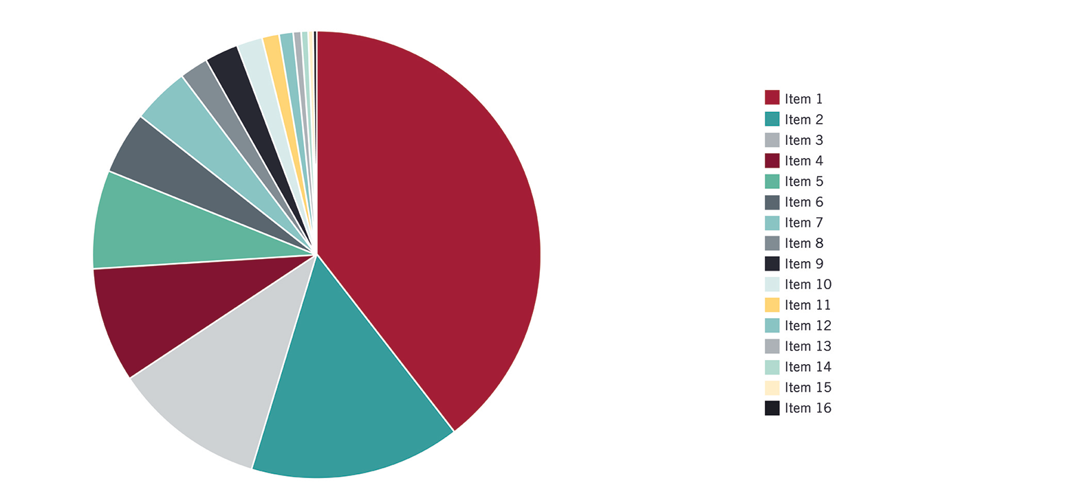
Eliminate redundant data...

...and prioritize presenting data closely tied to your story.
3.3.2. Color usage principles
Using color rules in data presentation is essential because colors enhance recognition and convey data messages, directly impacting the audience's emotions, mood, and behavior.
Here are basic color rules you can easily apply immediately to your data visualizations:
First, use a color palette for charts. In color science, a color palette refers to color harmony rules based on perception, vision, physiology, chemistry, and physics to create balance and visual harmony for viewers.
If you're wondering which palette to choose for data visualization, here are several options to consider:
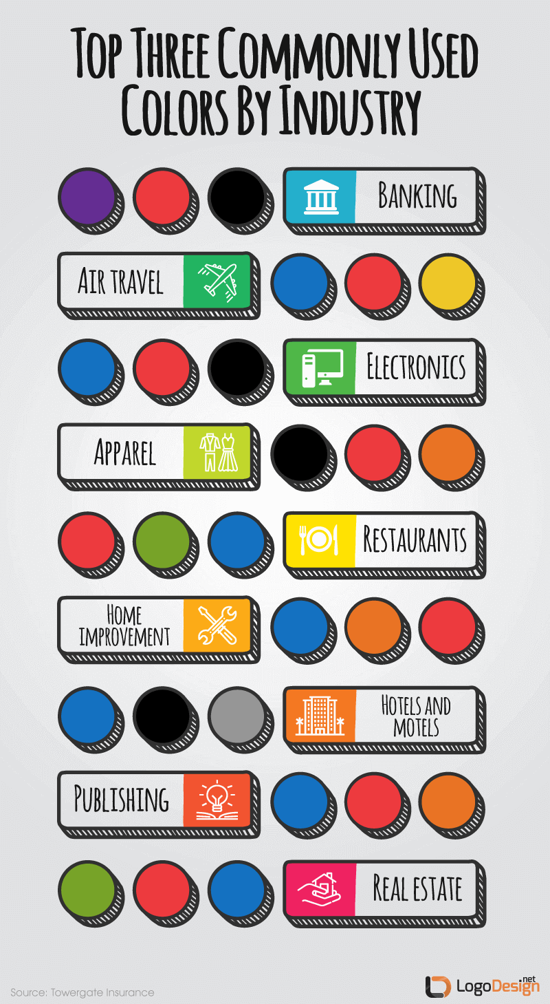
Use an industry-based color palette.

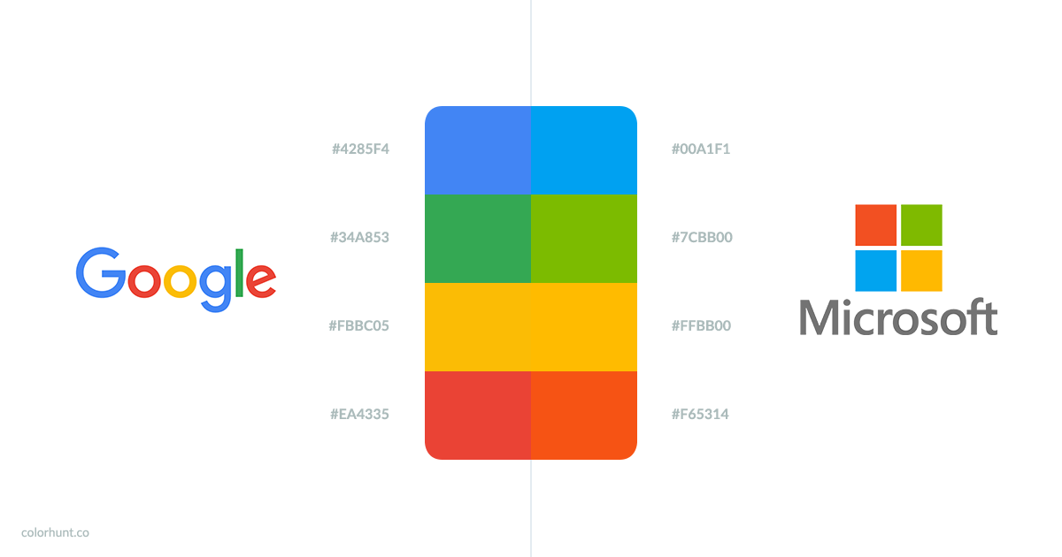
Use a palette based on the corporate logo of the business you work for or consult with.
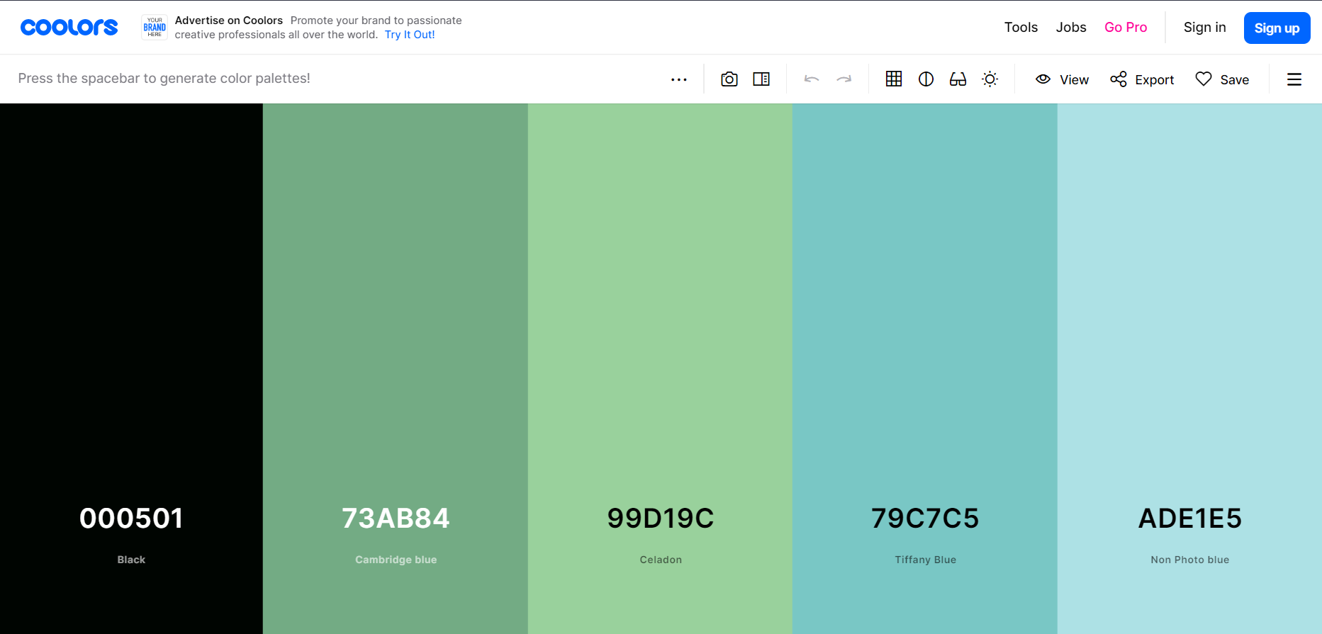
...or pick a palette you like on this website .
Another tip is that using a white background is a safe choice to easily highlight charts with other colors.
Second, adhere to basic color psychology principles . Each color carries a distinct meaning and deeply impacts human visual cognitive experiences.
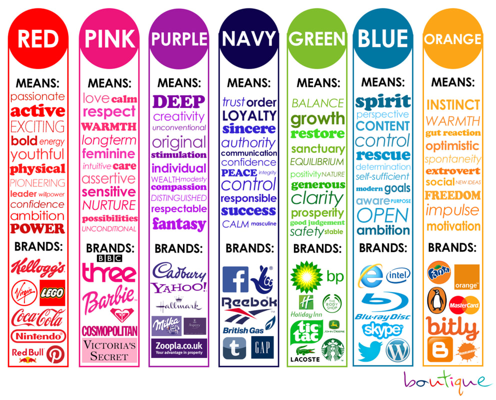
For instance, green represents positive meaning, red represents negative meaning, and yellow emphasizes points needing attention.
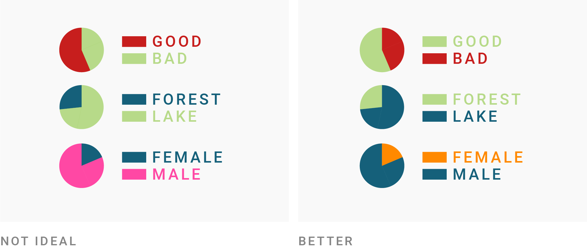
Third, use colors consistently for each type of data .
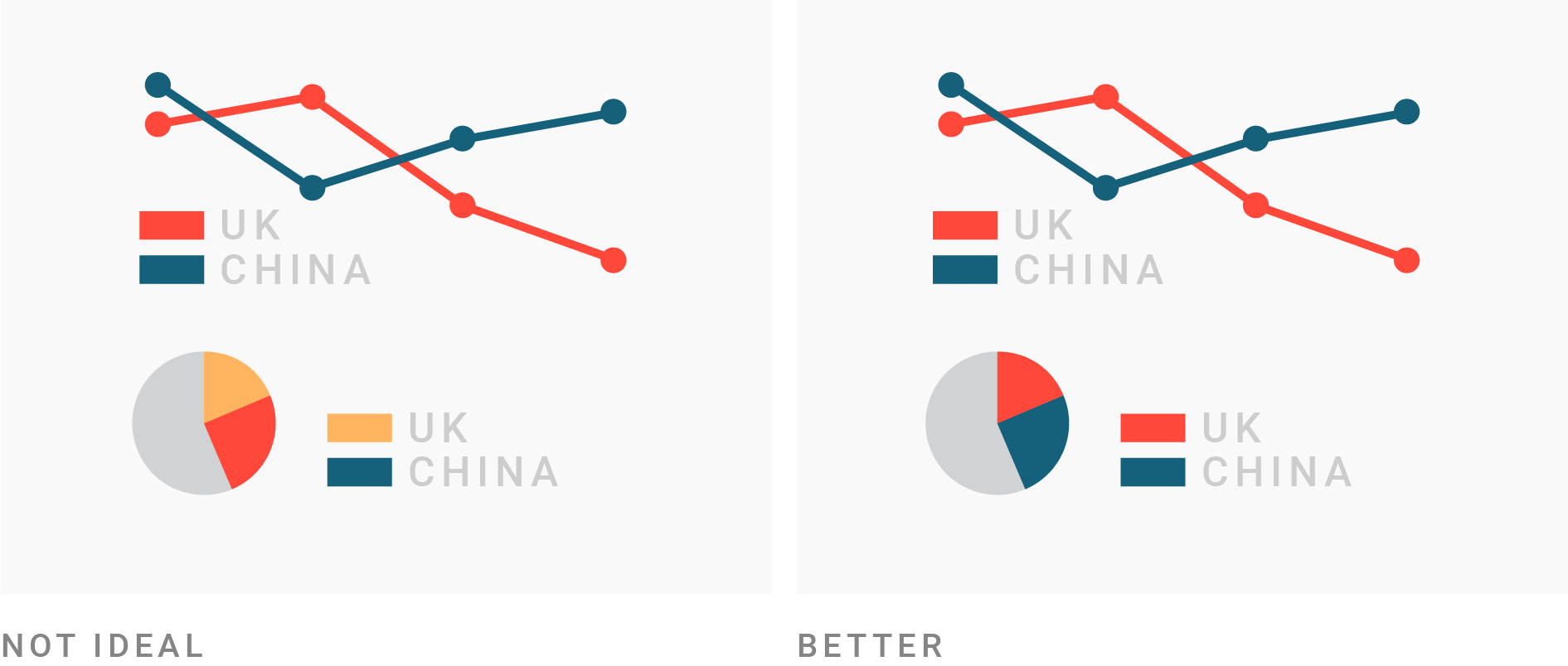
And finally, remember that minimalizing colors is always a good choice to highlight data (as well as prevent visual fatigue for the audience).
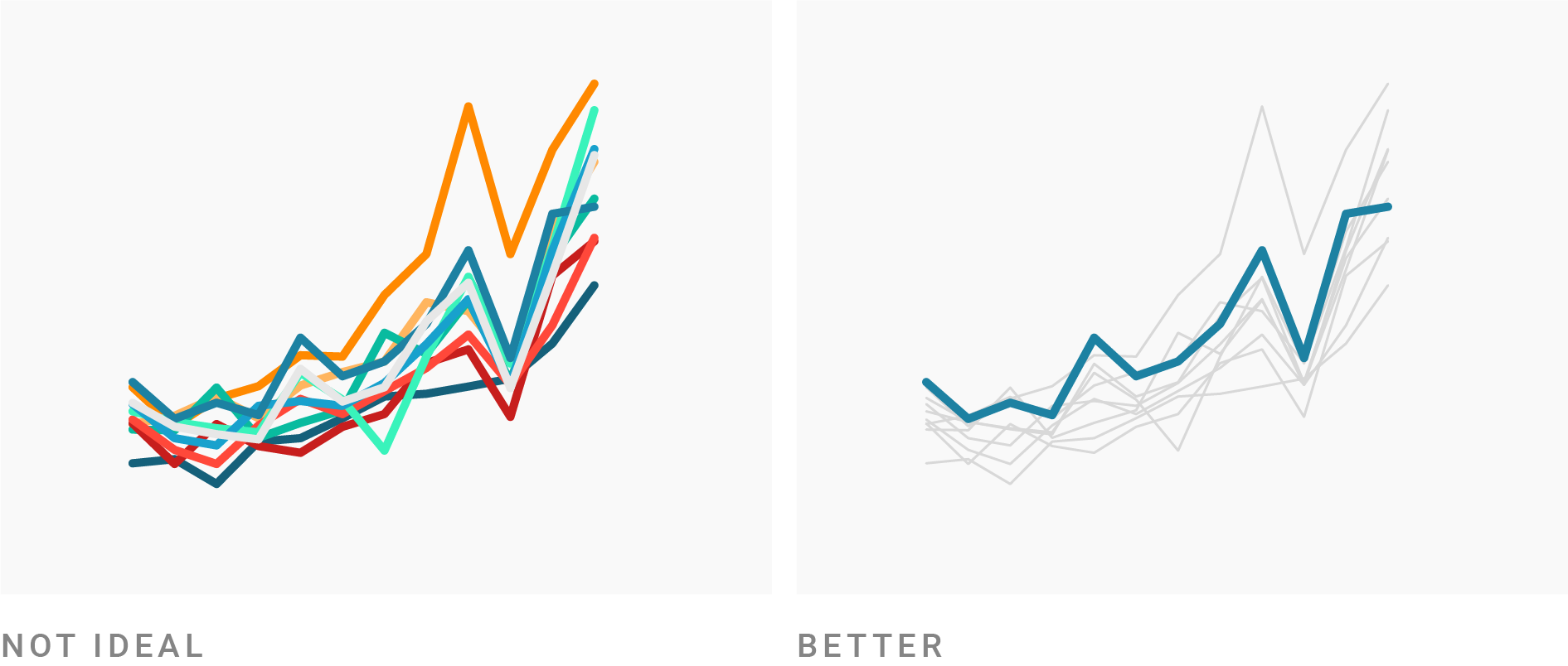
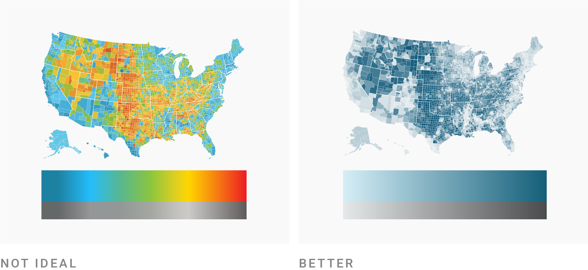
You can learn more color usage rules through the articles I referenced .
3.3.3. Data annotation principles
Annotating data is very important because it helps the audience grasp the content conveyed by data quickly and accurately. The faster they understand the story brought by data, the more willing they are to explore those stories.
Here are several data titling/annotation rules:
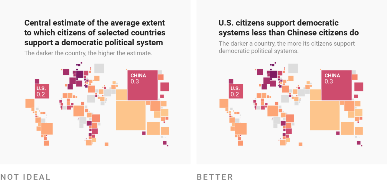
Titles should be concise, clear, and get straight to the point .

Titles should express the presenter's conclusion after exploring and analyzing the data .
To provide information in the most intuitive way for the audience, titles should include 3 elements:
What is measured (prefer items whose quantity can be accurately counted).
Time of data measurement.
Method of data measurement.
Between the two titles Annual Profit Report 2022 (1) and Audited Profit in 2022 Surged Sharply by 20% (2) , clearly title (2) helps the audience absorb the story we want to tell much faster.
Bottom lines
Thus, through this article, I have answered the following questions:
-
Why is data storytelling an important skill in today's digital era?
-
How to present and talk about data in a more compelling way?
Although easily applicable to real life immediately, all the tips mentioned in this article are just very basic rules of data visualization and data storytelling.
Therefore, if we truly want to master this skill, the most important thing is still to continuously explore new knowledge and practice diligently!
Below are some reference sources that I read while compiling information for this article:
-
Raconteur Infographics (A very great website for reference)
-
What to consider when choosing colors for data visualization
Thank you for reading my article!
Kim,